Jonathan Copeland

Helping people feel smarter in their day-to-day lives

Recreating Magic The Gathering in SwiftUI

24 June 2024

Over the past year, I’ve been spending more time exploring design ideas in code.

A recent project that I’ve just completed was to recreate every detail of the Magic the Gathering card structure in SwiftUI, with a wrapper app around this to swipe and search through a set of cards saved in JSON.

I had so much fun doing this, and the great thing about SwiftUI is how quickly you’re able to move from rough idea to a fully interactive prototype. Resources like Hacking with Swift and Copilot have helped speed up that cycle even further.

GitHub link


The Algorithm

10 November 2023

In the Elon Musk biography by Walter Isaacson, there’s a section (titled ‘The Algorithm’) which documents the lessons Musk learned during Tesla production surges.

These lessons are transferable to enterprise software development, so I’m documenting them here for future reference:

  1. Question every requirement. Each should come with the name of the person who made it. You should never accept that a requirement came from a department, such as from “the legal department” or “the safety department.” You need to know the name of the real person who made that requirement. Then you should question it, no matter how smart that person is. Requirements from smart people are the most dangerous, because people are less likely to question them. Always do so, even if the requirement came from me. Then make the requirements less dumb.
  2. Delete any part or process you can. You may have to add them back later. In fact, if you do not end up adding back at least 10% of them, then you didn’t delete enough.
  3. Simplify and optimize. This should come after step two. A common mistake is to simplify and optimize a part or a process that should not exist.
  4. Accelerate cycle time. Every process can be speeded up. But only do this after you have followed the first three steps. In the Tesla factory, I mistakenly spent a lot of time accelerating processes that I later realized should have been deleted.
  5. Automate. That comes last. The big mistake in Nevada and at Fremont was that I began by trying to automate every step. We should have waited until all the requirements had been questioned, parts and processes deleted, and the bugs were shaken out.

Additional quotes:

  • All technical managers must have hands-on experience. For example, managers of software teams must spend at least 20% of their time coding. Solar roof managers must spend time on the roofs doing installations. Otherwise, they are like a cavalry leader who can’t ride a horse or a general who can’t use a sword.

  • Comradery is dangerous. It makes it hard for people to challenge each other’s work. There is a tendency to not want to throw a colleague under the bus. That needs to be avoided.

  • It’s OK to be wrong. Just don’t be confident and wrong.

  • Never ask your troops to do something you’re not willing to do.

  • When hiring, look for people with the right attitude. Skills can be taught. Attitude changes require a brain transplant.

  • A maniacal sense of urgency is our operating principle.

  • The only rules are the ones dictated by the laws of physics. Everything else is a recommendation.


Magic x 40k teaser

04 November 2023

Over the past the past month or so I’ve been combining my love of iOS and Magic the Gathering my building a Magic x 40k card viewer. What’s great here is I’ve fully recreated the Magic card layout in SwiftUI, with the data drawing from a local JSON file. What I’m sharing today will serve as a teaser, with a breakdown coming later.

Magic x 40k teaser

Links:


Designing in SwiftUI at WWDC

10 June 2023

WWDC is one of my favourite times of the year, and this year I’m enjoying the SwiftUI related sessions.

I’ve previously linked to Philip Davis, and his excellent resources for designing in SwiftUI, so I was excited to see that at this year’s WWDC he has a session with Will Danner on ‘Design with SwiftUI’.

I’ll come back to this video in the future, so I thought I’d document some of favourite slides here.
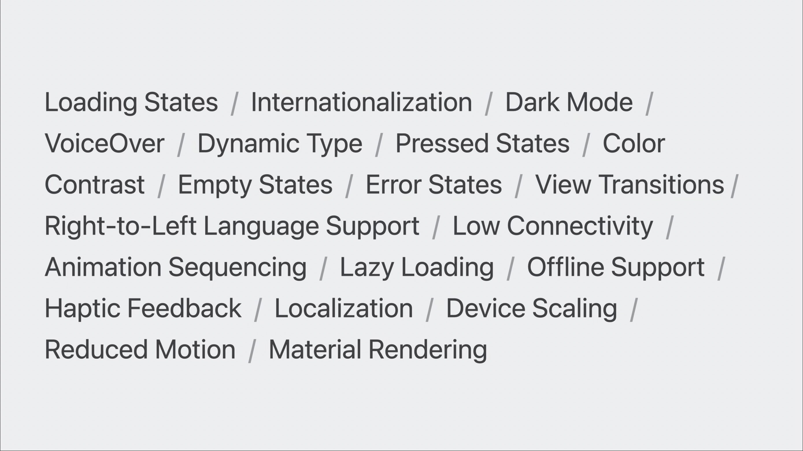
Designing in code helps you surface hidden states that are easy to miss in static design tools.
By designing in code you can test your app in the context where it will be used. The Maps team were able to test their app in the app's main context of walking and cycling.
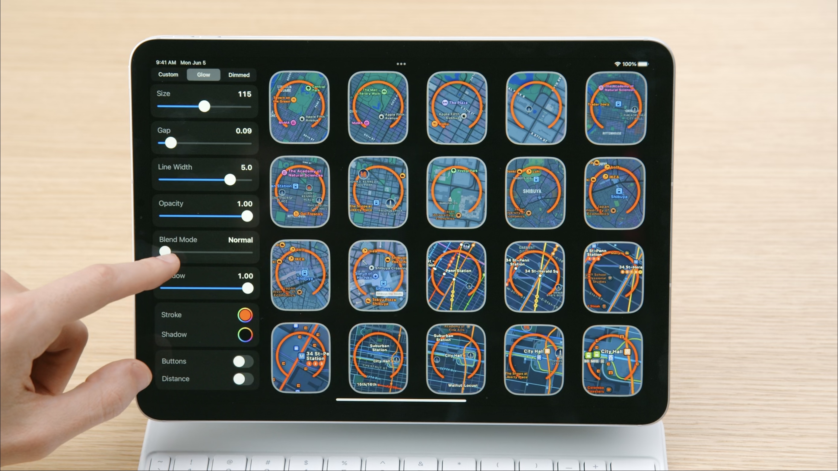
The Maps team were able to dynamically test multiple variants of the Walking Radius feature in Maps for watchOS 10 by using a mini design tool which they created to visualise a different states the app can find itself in.
The Maps team follow a demo culture, where they shows interactive prototypes, rather than presentations.
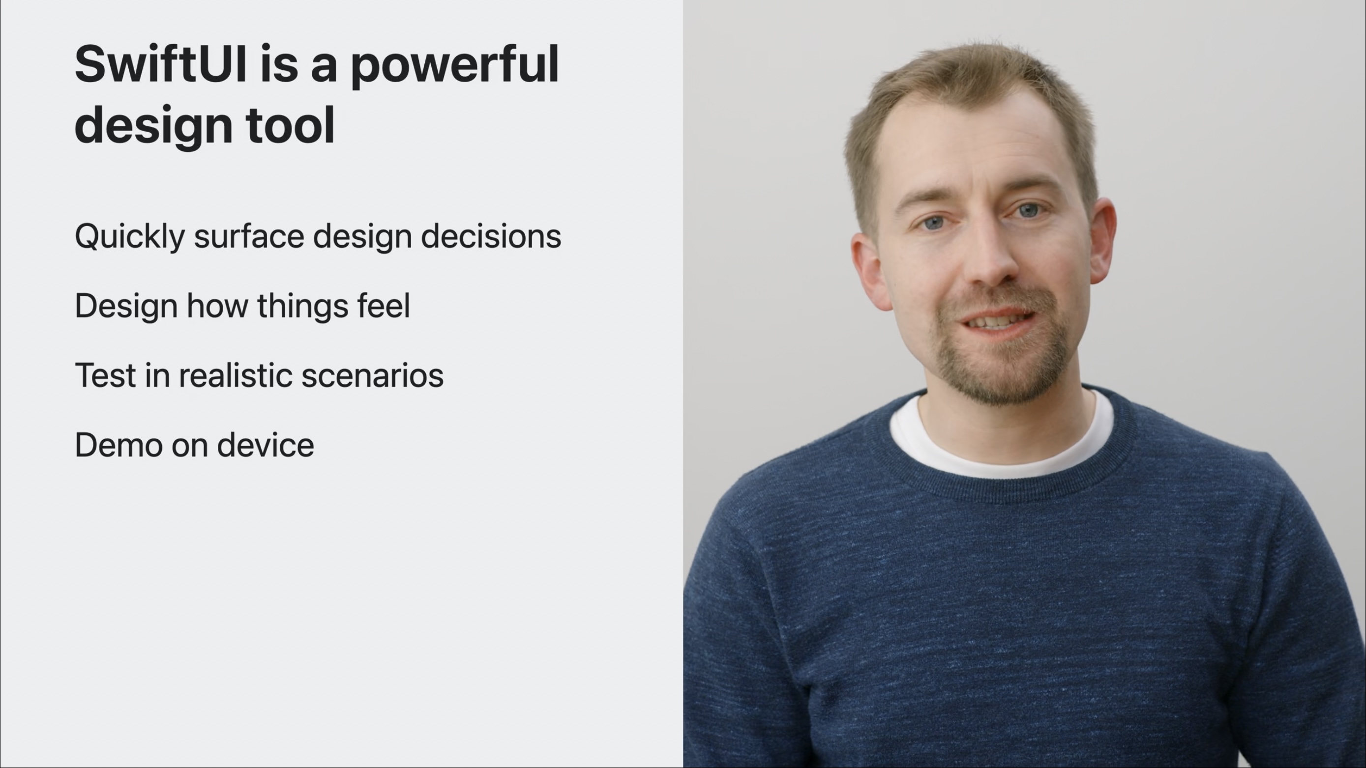
In summary SwiftUI allows you to Quickly surface design decisions, Design how things feel, Test in realistic scenarios and Demo on device.

The design process that the Maps team follow today feels similar to the process which the original “Purple” team used to delivered the first iPhone. This is detailed in Creative Selection by Ken Kocienda.

Here are some quotes from the book which feel relevant to me:

“He (Steve Jobs) used these demo reviews as his chief means of deciding how Apple software should look and feel and function.” ― Ken Kocienda, Creative Selection, p. 9

Software demos need to be convincing enough to explore an idea, to communicate a step toward making a product, even though the demo is not the product itself.” ― Ken Kocienda, Creative Selection, p. 35

“I want my demo audience to think they’re looking at something real, even though they aren’t. I know the demo isn’t an actual product, and my audience knows it too, but creating the illusion of an actual product is essential during the development process to maintain the vision of what we’re actually trying to achieve, and so my colleagues can begin responding and giving feedback as if the demo was the product.” ― Ken Kocienda, Creative Selection, p. 36

Demos made us react, and the reactions were essential.” ― Ken Kocienda, Creative Selection, p. 84

“Concrete and specific demos were the handholds and footholds that helped boost us up from the bottom of the conceptual valley so we could scale the heights of worthwhile work. Making a succession of demos was the core of the process of taking an idea from the intangible to the tangible.” ― Ken Kocienda, Creative Selection, p. 84

“Literally, we had to demonstrate our idea. We couldn’t get away with telling. We were required to show. We combined some inspiration, craft, taste, and decisiveness, and we shared our results. We had to work like this, because the team didn’t accept anything unless it was concrete and specific, a demo showing what we meant. Then we tried out each other’s demos, said what we liked and what we didn’t, and offered suggestions for improvements, which led to more demos and more feedback.” ― Ken Kocienda, Creative Selection, p. 134

Demo -> feedback -> next demo: creative selection.“ ― Ken Kocienda, Creative Selection

“We listened to guidance from smart colleagues. We blended in variations. We honed our vision. We followed the initial demo with another and then another. We improved our demos in incremental steps. We evolved our work by slowly converging on better versions of the vision. Round after round of creative selection moved us step by step from the spark of an idea to a finished product.”― Ken Kocienda, Creative Selection, p. 186

“We created new demos that were concretely and specifically targeted to be better than the previous one.” ― Ken Kocienda, Creative Selection, p. 117

The theme is that designing in code, with tools like SwiftUI, facilitates the creation of successful products. The improvements in Maps for watchOS 10 looks like a by-product of this process, and I’m looking forward to experiencing these changes later this year.


Airbnb Rooms and a return to skeuomorphism

06 May 2023

So many nice details in the Airbnb 2023 Summer Release. The playful animation used for onScroll and onTap for the Host Passport is delightful.

It’s interesting to increasingly see the return of skeuomorphic design in releases from the past year or so. Arc browser mobile, Apple Books, Hipstamatic (2023), Halide, Flighty, (Not Boring) apps are a few great examples that come to mind.

Links:


Browse the archive. Subscribe via RSS.