
The iOS App Icon Book
14 August 2022
It’s been a joy to rediscover and appreciate many of the apps that first lead me to become interested in digital design, through The iOS App Icon Book by Michael Flarup.
Digital products are difficult to preserve. Design is never done, products evolve, dependencies decouple, all making it difficult to go back and observe and learn from the work that brought us to where we are today. It’s because of this that books like The iOS App Icon Book are so important, becasue they help preserve our digital history.
The high-quality images help you notice and pay attention to the details, elevating the craftsmanship. As Michael Flarup says, “Designing app icons is design, distilled”. You first need to understand the value an app provides before you can visually communicate it through a mix of branding, typography and platform trends.
I’ve been inspired to recreate the icons from some of my favourite apps, and this process of breaking down and building up great design has been energising and inspiring.
“The single most important visual design element of your product is your app icon. You can spend all the time in the world developing a solid onboarding experience, relatable illustrations, sensible fonts, and pixel-perfect interface designs - but nowhere else is the pixels-to-impact ratio as high as in the app icon itself. That one image sits at the intersection between branding and utility; it’s the face of your product. It’s what people will interact with every day they use your app.” - Michael Flarup
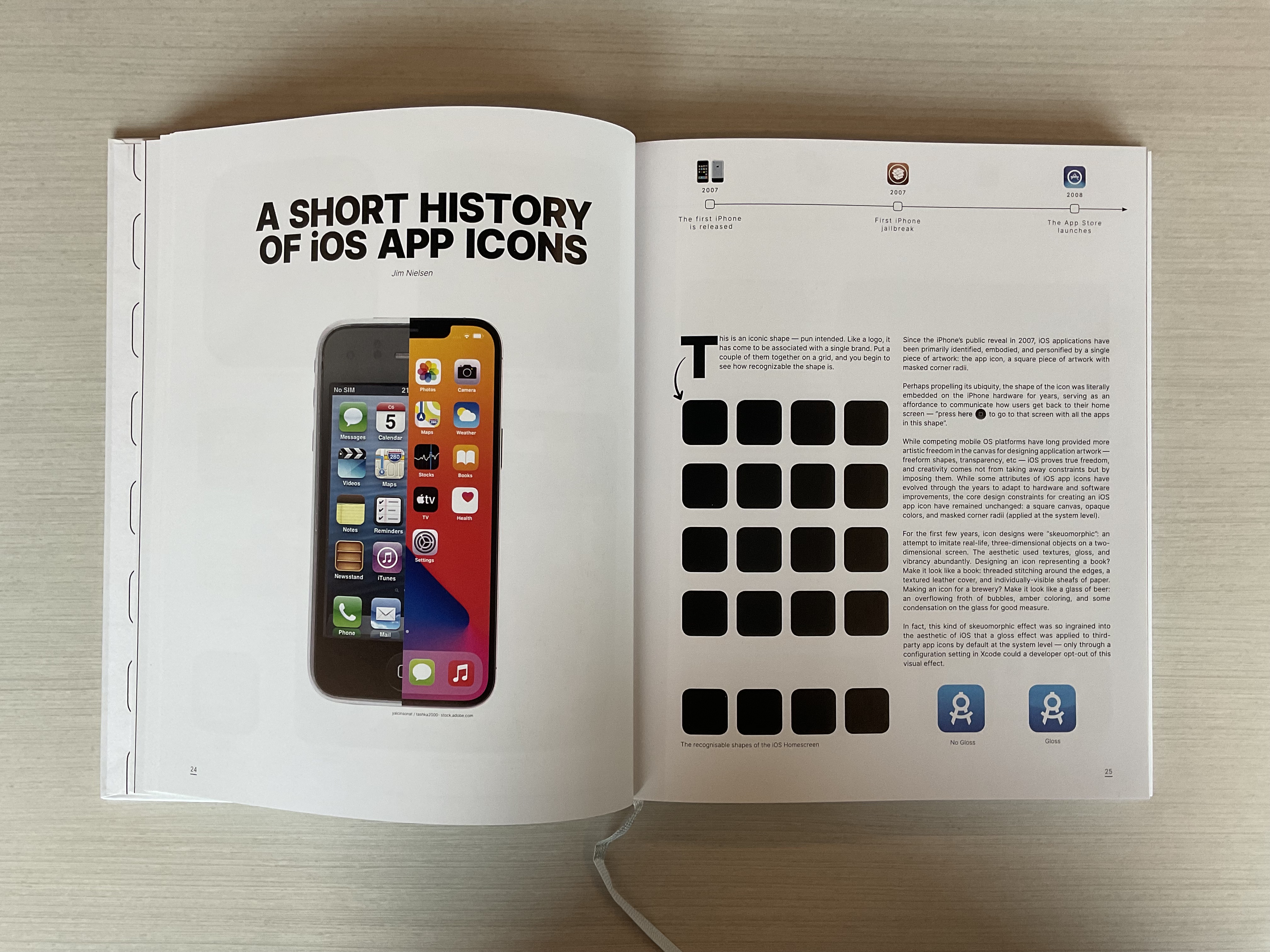
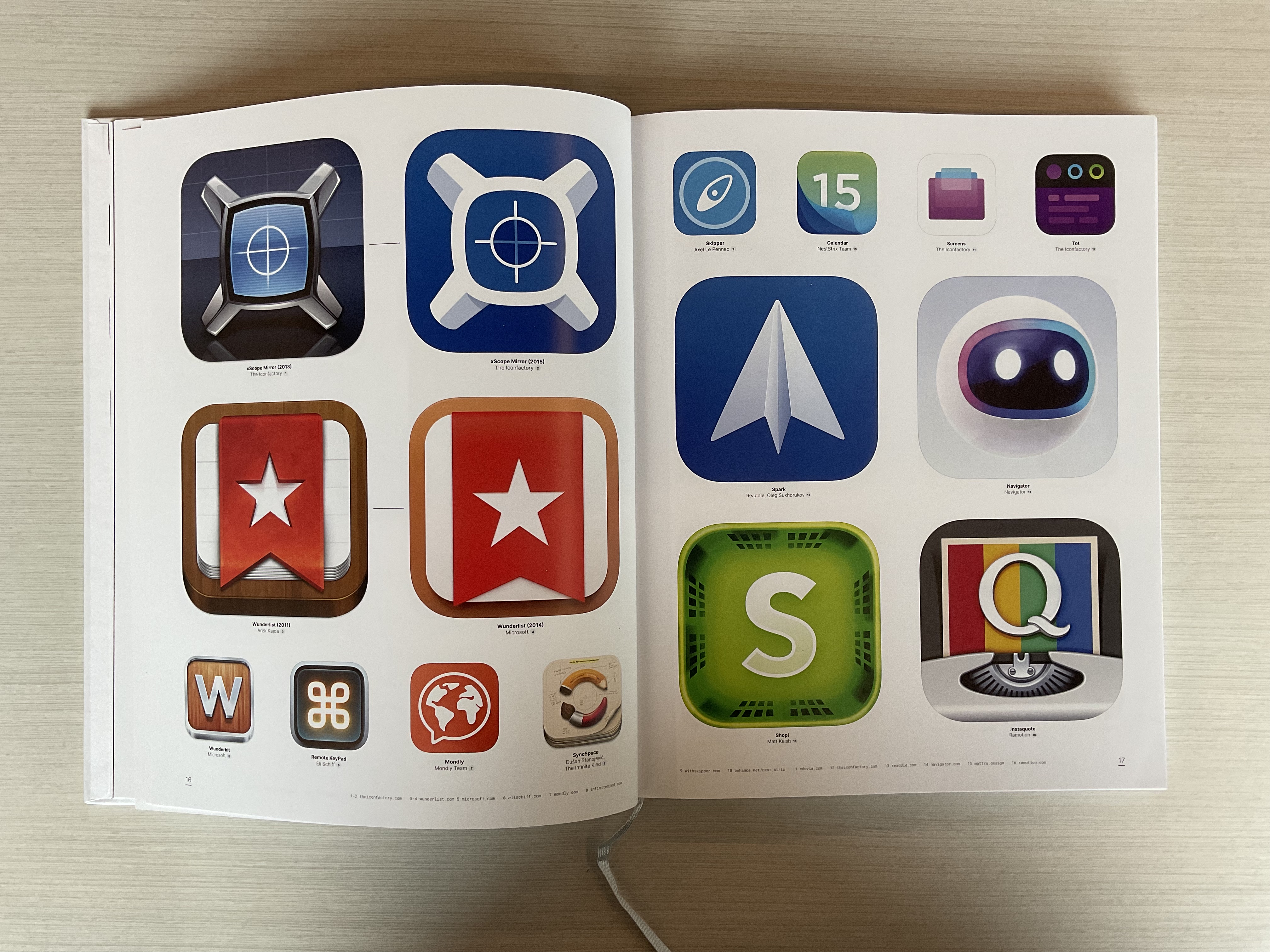
Here are a couple of my favourite pages:
Pick of a copy here!