Jonathan Copeland

Helping people feel smarter in their day-to-day lives

Splatoon 3's interface design

20 March 2023

Earlier this year I purchased Splatoon 3 and I’ve have been completely obsessed with it ever since. The combination of quick-fix multiplayer games, diversity of game modes and the overall fun and quirky energy has me hooked.

Something about Splatoon 3 that’s especially caught my eye has been its interaction and visual design. The game menu mostly takes place in a virtual town square, Splatsville, where the player can enter different shops and buildings to start various game modes. Once in one of these shops or buildings the interface is usually an overlay that the player can easily jumping in and out of. I’m saving some of my favourites here for future inspiration and appreciation for the designers behind them.

Loading states

The core game mechanic is shooting and swimming through ink, so it makes sense to illustrate loading as swirls of ink.

Splatsville

The player can enter different shops and buildings to start various game modes.

Pre-game

Game mode selection takes place in a mobile phone-like navigation that players can tap up-and-down through. The neon focus indicator matches the visual style of the shop fronts in Splatsville. Current maps and rules are displayed in a cardboard punch-out card.

Previous matches are saved in a history tab, and the player can see a picture of the map, ink colours used in the match as well their team’s score represented in a flowing lozenge of ink.

Rules are always accessible and displayed as a stack of scrapbook like cards, using images, and minimal text.

In-game

The in-game HUD is lean, showing your team, remaining time and score. Ink level can be monitored by viewing the backpack on the in-game character. In the bottom left the player can see their two ways to communicate with their team: by saying ‘This way!’ or ‘Booyah!’ - phrases which are surprisingly adequate.

The player can open a mini-map at any time, to see their team’s progress in splatting the map, or even to jump to a team-mates location after respawning.

Post-game

Points are tallied in a flowing lozenge of ink, accompanied with the labels of ‘Good Guys’ and ‘Bad Guys’. When the ‘Good Guys’ win, the screen breaks into celebration, with rock music, confetti and a range of in-season stickers dropping down and framing the map and score.

Bonus

As players progress, they unlock additional gear and items from the season’s Catalog. The Catalog is represented as a magazine that players can page through to see seasonal content.

The use of skeuomorphism continues in the Alterna story mode, where players create a scrapbook of things they learn as the story progresses. These scraps range from post-it notes, to stickers, magazine cut-outs and pencil scribbles, all adding context to the Splatoon world and lore.

Links:


100 Days of SwiftUI, Day 15 Swift overview

13 February 2023

I’ve enjoyed how lightweight Swift feels in comparison to other languages like C++ or Java. I’ve noticed this in it’s concise and readable syntax, as well as it’s helpful compiler which gives clear feedback as to where to debug your code.

For future reference I’ve made a Swift overview document that can be found here.

Day 15 of the course includes this great Learn essential Swift in one hour video which demos various features.


Don't stay in your lane!

17 December 2022

I’ve been re-listening to the soundtrack of the Netflix original series Maniac. The composer Dan Romer absolutely nailed the tone and spirit of the show, and I’ve been trying to learn more about him and his approach - which lead to me to listen to an interview he did on Score: The Podcast S4E9

It’s a great discussion, but this segment particularly stood out to me:

“I get the question fairly often, ‘I want to be a film composer, what do I do?’ The thing I always say is, just learn to be a musician. Learn to do every part of the music process. Don’t look film scoring in the eye.

I never intended to make film music. If you say that all you want to do is score films or video games or TV, those jobs aren’t everywhere - especially for aspiring composers. So you need to figure out your jobs. You might not become a film composer,… but you might become something else.

It is a lot better for your life, career and creativity to say, ‘I just want to make things. It’s going to happen however it’s going to happen, but I can’t control that so I am just going to do my best whenever I can.’”

I love where he advises not to look film scoring in the eye, but to simply “make things”. This reminded me of a snippet from Keep Going by Austin Kleon:

“Job titles can mess you up. Job titles, if they’re taken too seriously, will make you feel like you need to work in a way that befits the title, not the way that fits the actual work.

Job titles can also restrict the kinds of work that you feel like you can do. If you only consider yourself a “painter,” then what happens when you want to try out writing? If you only consider yourself a “filmmaker,” what happens when you want to try sculpting?”

This thinking translates to product design where I see the best designers, PMs, and engineers borrow thinking and processes from other disciplines. The way to mastery is not staying in your lane!


Takachizu, Community “Show & Tell”

15 December 2022

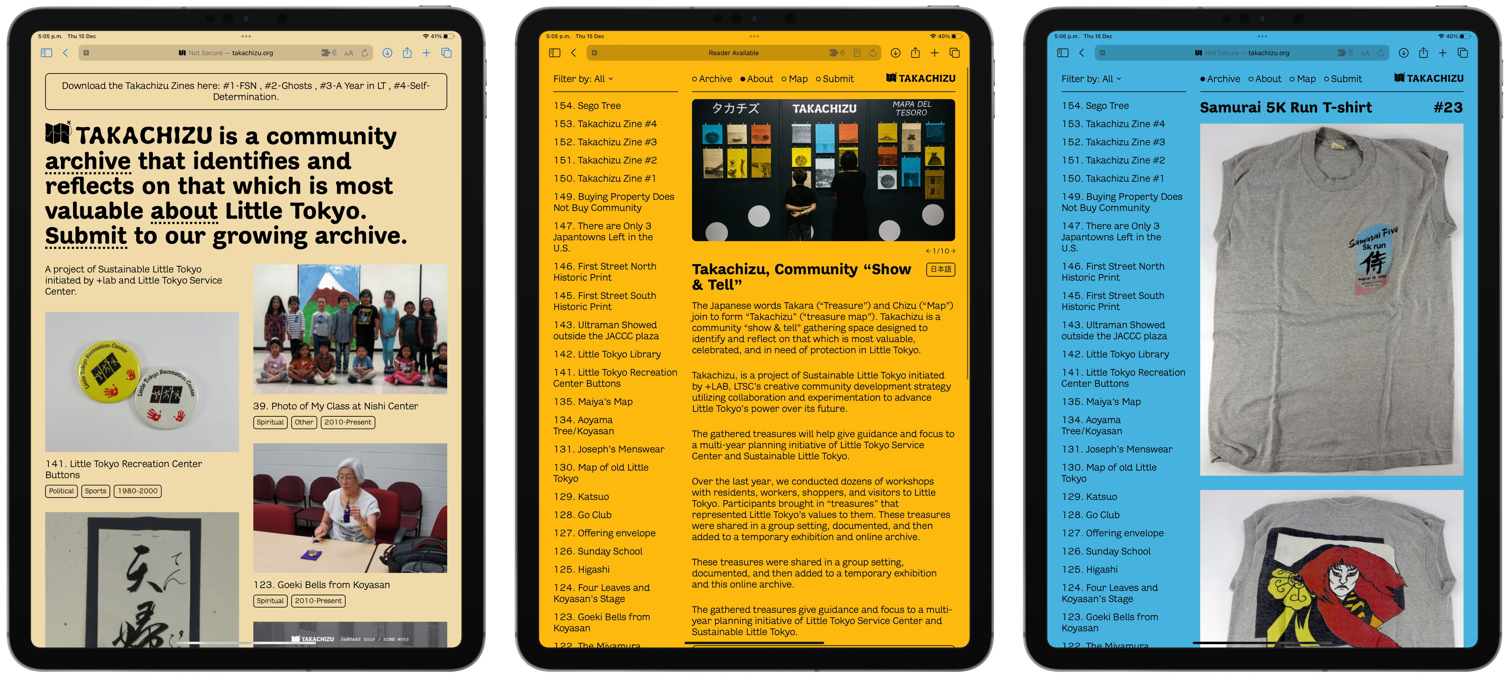
Lately, I’ve found joy in rediscovering the web. One of my favourite finds has been takachizu.org, a community archive for Little Tokyo, Los Angeles.

The site uses bold colours, typography and layout to surface everyday “gathered treasures” from across the community - it even includes downloadable Zines.

“The Japanese words Takara (“Treasure”) and Chizu (“Map”) join to form “Takachizu” (“treasure map”). Takachizu is a community “show & tell” gathering space designed to identify and reflect on that which is most valuable, celebrated, and in need of protection in Little Tokyo.” - Takachizu, about page

The Home, About and Archive pages.

The iOS App Icon Book

14 August 2022

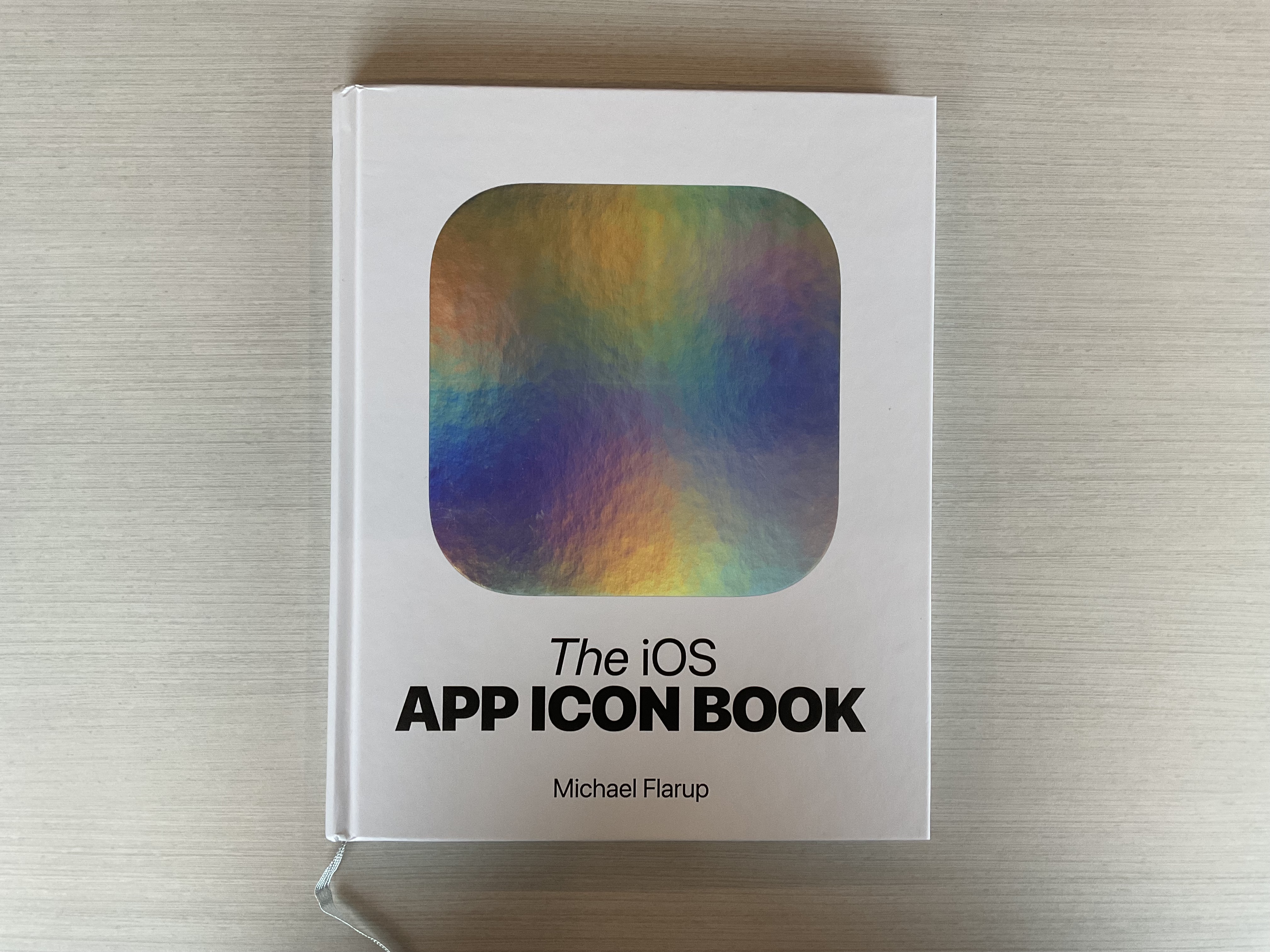
It’s been a joy to rediscover and appreciate many of the apps that first lead me to become interested in digital design, through The iOS App Icon Book by Michael Flarup.

Digital products are difficult to preserve. Design is never done, products evolve, dependencies decouple, all making it difficult to go back and observe and learn from the work that brought us to where we are today. It’s because of this that books like The iOS App Icon Book are so important, becasue they help preserve our digital history.

The high-quality images help you notice and pay attention to the details, elevating the craftsmanship. As Michael Flarup says, “Designing app icons is design, distilled”. You first need to understand the value an app provides before you can visually communicate it through a mix of branding, typography and platform trends.

I’ve been inspired to recreate the icons from some of my favourite apps, and this process of breaking down and building up great design has been energising and inspiring.

“The single most important visual design element of your product is your app icon. You can spend all the time in the world developing a solid onboarding experience, relatable illustrations, sensible fonts, and pixel-perfect interface designs - but nowhere else is the pixels-to-impact ratio as high as in the app icon itself. That one image sits at the intersection between branding and utility; it’s the face of your product. It’s what people will interact with every day they use your app.” - Michael Flarup

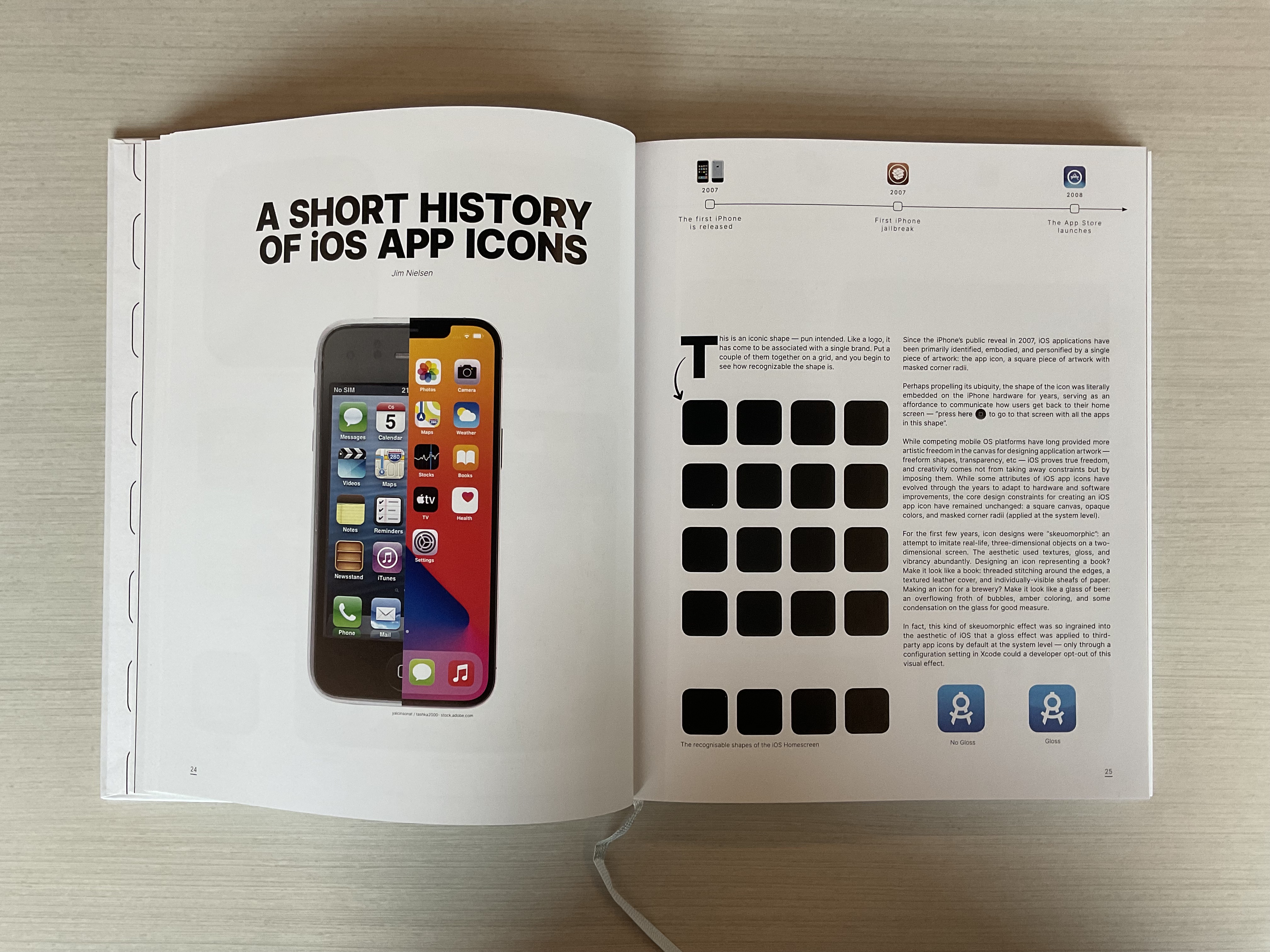
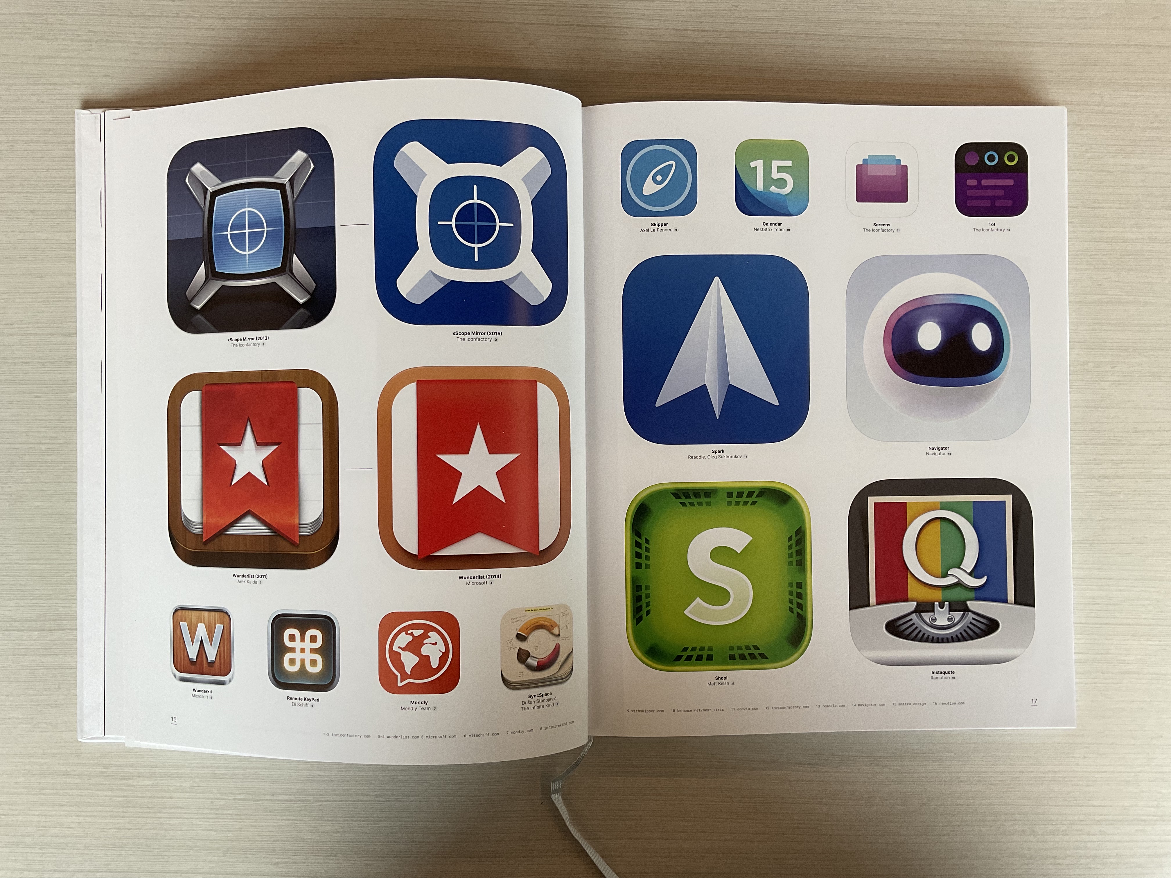
Here are a couple of my favourite pages:

The cover has this cool reflective material.

It's amazing to see the evolution of the homescreen when you display the original iPhone alongside the iPhone x.

I was especially excited to see the original Wunderlist app icon.

Pick of a copy here!


Browse the archive. Subscribe via RSS.